Fourier transform is a wonderful linear transform which converts a signal into its inverse dimension. For a signal with dimensions of space, FT converts it to a signal of spatial frequency. For a 2D image, the FT is given in the equation below. A powerful implementation of FT is the fast fourier transform algorithm which is fft2() in matlab and something similar in other packages. This function however has different properties and we should be careful in using them.

For our 186 subject, it is a required skill to be familiar with and to know by heart the fourier transform of different patterns. There are a few get away tips to easily familiarize oneself on FT. first is that the FT of a pattern is in inverse dimension of those of the pattern. From here, we can say that when the pattern is long then the FT is short or when the pattern is short the FT will be long. The FT of a small aperture will be wide. Second is that when the pattern is rotated, the FT will be in the same rotation. Last is that the product of two patterns will have a FT of the sum of the individual FT of the patterns. It is also important to note that the FT of an FT of a pattern is the pattern itself, so a pattern and its FT is somehow like a pair. So now, we look at FT of some basic patterns.
Figure 1 shows the FT of a circle. 1(a) is the circle. This pattern could be thought of as a circular aperture. Figure 1(b) is the output of the FFT algorithm, which is not yet center shifted. This should always be noted in using FFT algorithms from packages. The function fftshift() can fix it. Figure 1(c) is the FFT of the circular aperture, which is an Airy pattern. Note that the pattern is medium sized, producing a medium size FT. Figure 1 (d) is the FT of the Airy pattern in figure 1 (c) showing that the FT of the FT of the circle is a circle. It should be noted also that the FT of a function is complex. Figure 2 shows the real and imaginary parts of the FT.

Figure 1. The FT of a circular aperture. (a) the circular
aperture. (b) The pattern produced by the FFT algorithm. (c) The FT of the
pattern. (d) the inverse fourier transform of the FT.

Figure 2. The complex FT of letter A. (a) the pattern A. (b)
The FT of the pattern. (c) The FT of the FT of the pattern. (d) The real part of
the FT of the pattern. (e) The complex part of the FT of the pattern.
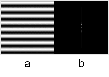
Figure 3. a) A sinusoid along x (corrugated roof) b) The FFT
of the sinusoid which is a two dirac deltas and a direct delta at the center 0.
Figure 3 shows the FFT of a sinusoid along x, which is a two dirac delta with peaks corresponding to the frequency of the sinusoidal signal. For the fourier series, any signal can be expressed as a linear superposition of weighted sines and cosines of different frequencies. The fourier transform shows the distribution and the relative strengths of sinusoids in the signal. In this case, the frequency as which the sinusoid was made is at the peak of the dirac delta, which is the sinusoid with the highest strength. The spread of the dirac delta shows the other available signals. A constant signal is like a sinusoid with a very low frequency, which has an FFT of dirac deltas very near the center 0. So for a constant signal, the FFT is at the center. A double slit however, as seen in figure 4, can be thought of as a many dirac delta signals along the y axis centered at x = 0. It’s FFT will be a sinusoid along x-axis. Another signal that can be thought of as a superposition of many sinusoids is a square pattern. The FFT is a sinusoidal signal forming a cross. Since the square is wide along x and along y, the FFT is thin and long along x and y.

Figure 4. The double slit and its FFT which is a sinusoid
along the x-axis but confined only along y = 0.

Figure 5. Square and its FFT, which are sinusoids along x
and y forming a cross
A Gaussian bell curve will always have a Gaussian as its
FFT. A small pattern will have a big FFT. This is shown in figure 6.

Figure 6. The FFT pair which is a small and big 2D Gaussian
bell curve
Simulation of an imaging device
Convolution is used in imaging such that the resulting
convolution of 2 patterns looks like both the 2 patterns. The result is like
the smearing of one pattern to the other. For an object, the resulting image
taken by an imaging device is the convolution of the object and the transfer
function of the imaging device.
It is also essential to note that the FFT of a convolution
is the product of the individual FFT of two patterns. With this in mind, to
determine the FFT of a difficult pattern, the pattern could be broken down to
easy patterns with known FFT and obtain the product of the FFTs.
In the next part, we will simulate an imaging device. For a
digital camera for example, the finite lens radius limits the gathered rays
reflected from the object, making the reconstruction imperfect.
We have an object which is the letters VIP in Arial font.
The imaging device is shown by a white centered circle. In figure 7, radius of
the imaging device was increased from left to right. The increase in the radius
of the imaging device reblurred the reconstructed image. The greater the
radius, the better the quality of the produced image. This can be observed also in a video bellow where the radius of the aperture increases.

Figure 7. The convolution of the letters VIP and a circle
with varying radius. a) r = 0.1 b) r = 0.3 c) r = 0.5 d) r = 0.7 e) r = 0.9
Template matching using correlation
Correlation is another tool used to look into the degree of
similarity of two patterns. The high the correlation at a certain pixel implies
that the patterns are identical at that point. This can used for template
matching or pattern recognition. For the activity, we used a template with the
text: “THE RAIN IN SPAIN STAYS MAINLY IN THE PLAIN” in Arial 12. The letter “A”
typed also in Arial 12 was correlated with the pattern. The center of the bright
spots show the center of the location of the letter “A”.

Figure 8. Template matching using the correlation of a
letter to a pattern. a) The pattern used. b) the letter A was detected in the
pattern. c) The brightest spots in the correlation shows the centers of the
location of the occurrence of A in the pattern in (a).
Another template matching application if the edge detection
in an image using an edge pattern. The edge patterns used are 3x3 matrices such
that the total sum of the elements is zero. Figure 9 shows the edge patterns
used and its convolution with the VIP image. As can be seen the white pixels in
the convolution represents the areas at which the image and the edge pattern matches.
For the horizontal pattern (a) the horizontal lines were not seen while the
vertical lines were not seen when using the vertical pattern (b). The slant and
curve edges for (a) and (b) looks pixelized and was badly connected. A clean
detection was done by the spot (c). For the diagonal patterns in (d) and (e),
the verticals and the horizontal lines were not detected.

Figure 9. The edge patterns used (upper panel) and its
convolution with the image VIP (lower panel) the edge patterns are: a)
horizontal b) vertical c) spot d) diagonal with a negative slope e) diagonal
with a positive slope.
For this activity, I would give myself 10/10 for the
activity. In general, this activity is not that fun, however, among all the
activities, I enjoyed looking at the edge detection results in images and the
template matching using correlation. I did it for the exploration part.
However, I did not get to finish the template matching.
At first I thought that the correlation would be a nice technique to be
used for handwriting character recognition such that a program can recognize
each letter from an image of text. However, changing the font and the size of
the template letter would not make it detectable for the program anymore. Good
thing however, I did center shifting using the centroid of the letters before doing the correlations so that shifting the location of the template letter from the center
would still make it detectable since. In figure 10, I correlated all the letters in
the text with the text image. My plan is to correlate each letter to the image
and the peak locations would mean that the letter occurred in that location.
The program will then reconstruct the text in the image using the letters and
the peak locations basing on the index. The spacing between the words would be
neglected. The problem however is for letters with high correlations. A nice
example would be the letter I, where it detected 14
peak locations instead of 6.

Figure 10. The correlations (shown in the lower panels) of
the image in figure 8 a) with the letters (shown in the upper panels).
For the edge detection, I planned on using only the spot
edge pattern since the results in the VIP image is clean, however, when using
it alone, the resulting edges are not continuous and smooth. It also detected some
undesired edge which created noise in the image. So for this, I added each of
the resulting convolutions of the image with the edge patterns (horizontal,
vertical, spot, diagonal with a negative slope, and diagonal with a positive
slope) and applied a threshold to clean the image. I compared the technique to
the edge detection package in Matlab using the Prewitt algorithm. The results
are shown in figures 11 and 12. The edge detection method is shown in column b
while the Prewitt algorithm is shown in column c.

Figure 11. The application of edge detection method to the images in column a) using convolution with the edge patterns (column b) compared with the Prewitt algorithm (column c)

Figure 12. Another application of the edge detection method to the images in column a) using convolution with the edge patterns (column b) compared with the Prewitt algorithm (column c)
For the images in figure 11, the results of the convolution is better compared with the Prewitt algorithm since most of the essential details were overlooked by the Prewitt algorithm such as the jaws of the kid, the outline of its face, etc. The result of the convolution however is messier as can be observed in the uppermost panel.
For the images in figure 12, the Prewitt algorithm produced cleaner and better results. Some edges, especially in the middle panel, were omitted by the convolution method while it was perfectly outlined by the Prewitt.
To improve this method, one can think of a way to give weights to the effect of convolving different patterns in the image. The identification of the threshold for each image could also be automatically known using the histogram of the intensity.
I would like to thank Elijah Justin Medina for all the creative ideas which either he shared or was inspired by him. I cannot accurately remember some, but there sure are a lot of things he contributed into the making of this activity.
I would like to thank Elijah Justin Medina for all the creative ideas which either he shared or was inspired by him. I cannot accurately remember some, but there sure are a lot of things he contributed into the making of this activity.
Beyond the edge of the world there’s a space where emptiness and substance neatly overlap, where past and future form a continuous, endless loop. And, hovering about, there are signs no one has ever read, chords no one has ever heard. - Haruki Murakami, Kafka on the Shore


